Protrusion
< Fonts
Character protrusion is a somewhat subtle advanced typographic effect in which some characters (often punctuation) are moved partially or fully into the margin in order to give it an optically smoother appearance. In ConTeXt, this is achieved via the font mechanisms within pdfTeX. Much of the difficult work is done in some presets by Hans, but there are a few tricks needed in order to activate the feature.
This feature is also commonly called "Handling" after the font handling feature that enables it, and "Hanging" after what hyphens do into the margin. The microtype LaTeX package also includes a protrusion feature, and may be known by that name to a certain audience.
Font handling is documented in the Fonts in ConTeXt manual.
Demo
The simplest way to illustrate it is with a quick demo:
\usetypescript[postscript][ec]
\usetypescript[adobekb][ec]
\usetypescript[serif][hanging][normal]  % this creates the 'handling' synonyms
\setupalign[hanging]                    % this actually triggers the feature
The first two lines switch the font (see below for Latin Modern), and the second two lines actually activate the feature.
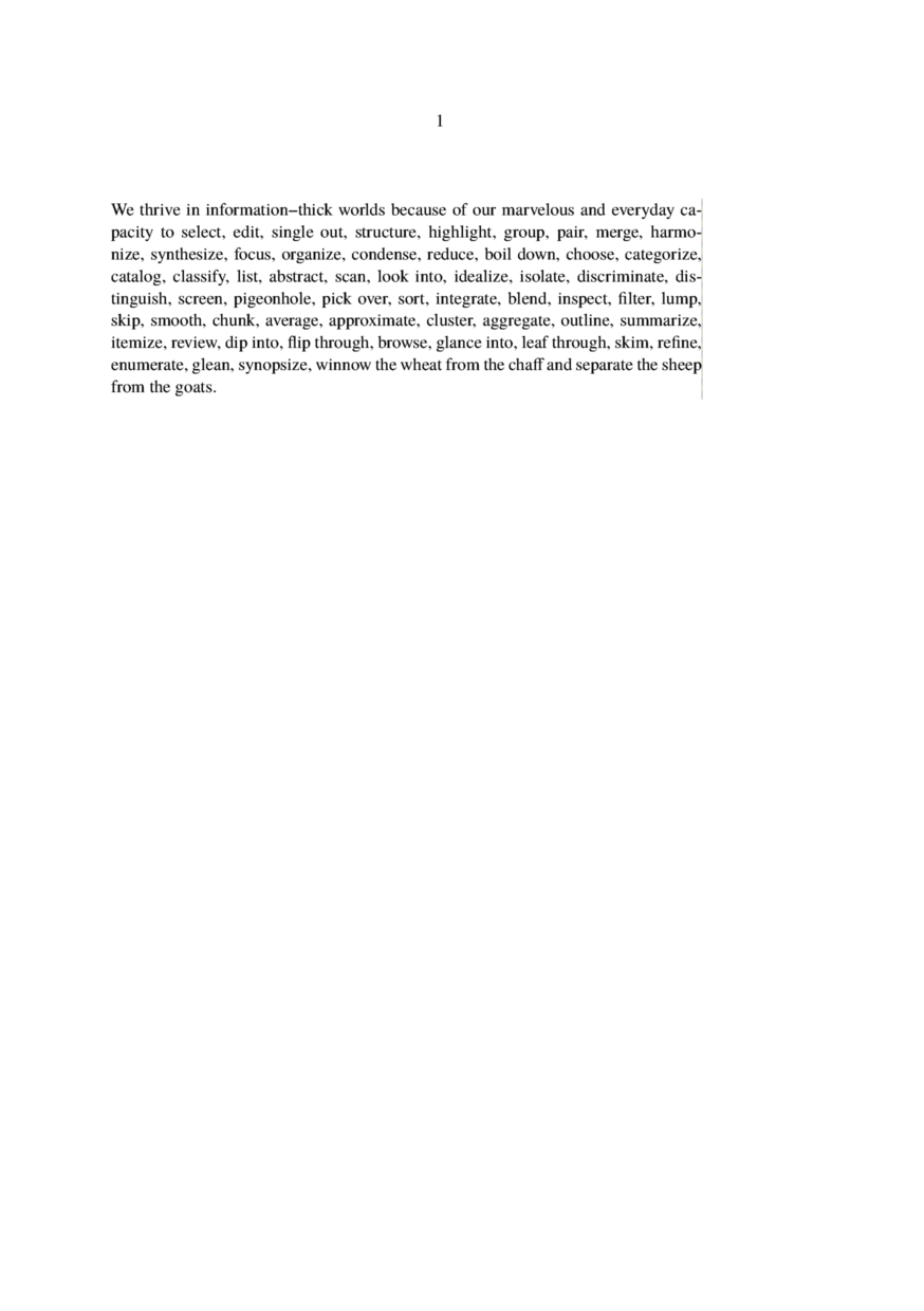
\setupbodyfont[postscript]
\starttext
\input tufte
\stoptext
Switch the font that we setup, and show an example with lots of punctuation. The illustration has normal hanging enabled:
Details
The \usetypescript command has three arguments. The definitions that we use are in type-exa.tex, and reference the low-level definitions in hand-def.tex. There are different possible values for each argument, which, by convention, are:
\usetypescript [family] [trigger] [type]
| family | serif, sans, and/or mono | |
| trigger | handling or hanging for protrusion; handling or hz for font expansion | |
| type | pure | full protrusion of only selected punctuation |
| normal | partial protrusion of punctuation and some asymmetrical letters | |
| hz | variable correction of character widths | |
| quality | combination of hz and pure | |
| highquality | combination of hz and normal | |
Use with Latin Modern
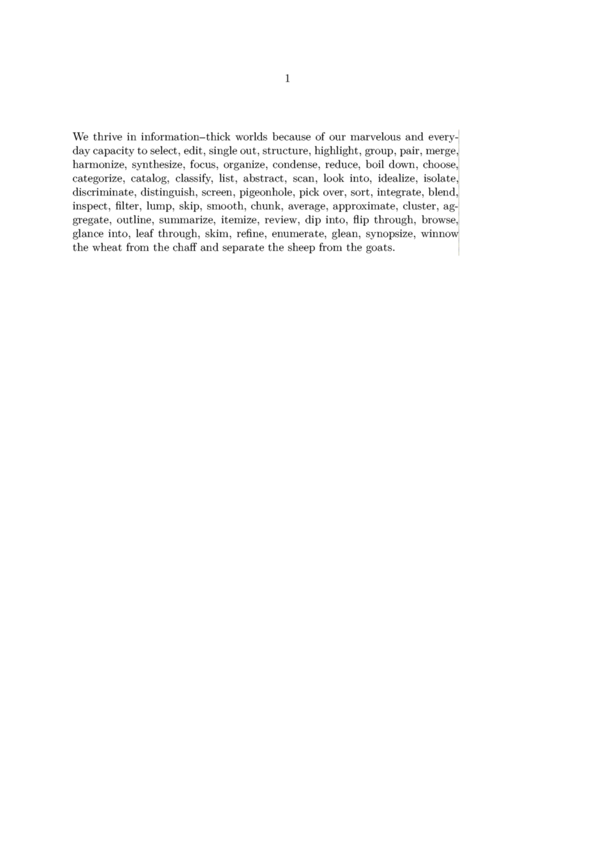
Because ConTeXt pre-loads its default Latin Modern font, it is a little tricky to get it to work right. Here is one solution, where you setup the hanging, load an alternative latin-modern typescript, and then reset the defaults:
\usetypescript[serif,sans,mono][hanging][pure]
\setupalign[hanging]
\usetypescript[modern-base][texnansi]  % a simplified latin-modern typescript
\setupbodyfont[reset]
\setupbodyfont[modern]
The illustration has pure hanging enabled:
Hz adjustments
For more radical effects, where you need to fit to a fixed, narrow measure, you can enable Hz-style font adjustments, wherein individual characters are adjusted by miniscule amounts as necessary. These are enabled by the hz, quality, and highquality options listed above. Usage is with such lines as:
\usetypescript[serif][hz][quality]  % this creates the 'handling' synonyms
\setupalign[hanging,hz]        % this turns on the hanging and hz features
The example shows how slight font expansion improves the fitting to the margin without changing the tolerance on the inter-word spacing. The left passage is with hanging alone enabled, and the right is with hanging and hz both enabled. It's not for everyone, as the process can distort letter shapes.

MkIV
\definefontfeature[default][default][expansion=quality,protrusion=quality]

\usetypescript[modern-base]
\setupbodyfont[reset,modern]

\setupalign[hz,hanging]

\showframe

\starttext
\input tufte
\stoptext